Thursday, March 31, 2016

Problems with R-squared and Overfitting Models


When it comes to fitting a model to your data, it is important to remember that just because you have a good R2 value (~1.0), that doesn’t mean that your model is the best at estimating your actual population.

Looking at similar data sets and studies can help you determine if your model and R2 are consistent with what has been done in your field.  Jim Frost discusses how physical processes tend to be predictable, have low variation, and a high R2 value. However, if you are a psychologist and study human behavior, which is highly variable, a high R2 value could indicate that your model, and therefore your sample size, does not best represent the population data.

Frost continues by addressing a few possibilities that may explain a high R2 value. For example, an R2 value is already biased because it is based on your sample data. Another reason that your R2 may be too high is that you’re trying to fit too many models to your data just to find the perfect fit. As we’ve discussed in class, it is very important to pick your statistical model before you perform any experiments.

A very important problem encountered with fitting a model to data is the issue of “overfitting”. This means that your model is too complicated for your data set. If you think about, you can probably force any equation to perfectly fit your data. But remember, your data are collected from a sample that is generally meant to represent a population. An overly complicated model may not accurately predict future data points. Overfitting can cause your statistical values to be misleading. Having a large sample size can help overcome this problem and allow for better modeling of complex parameters. Remember, as Frost said in an accompanying article:
The more you want to learn, the larger your sample size must be.”

I haven’t performed any experiments in my laboratory that require fitting a model to data, so I would be interested in knowing if any of you have come across these issues. Do you come across R2 values that are uncommon for your field? Is overfitting a common issue in your lab?


What the model of human population growth means for the apocalypse


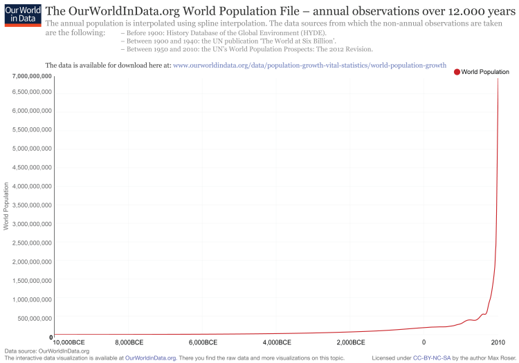
Environmentalists, social advocates, and apocalypse-aficionados all enjoy scaring the masses with the idea of the exponential growth of the human population.  At first glance, the dire warnings of overpopulation seem completely supported, given the explosion from 2.5 billion people in 1950 to more than 7 billion people today.  But is an exponential model, always increasing at an increasing rate (general form: dN/dt = rN), really representative of how we will expand?  Intuition says no.  There has to be a cap in our growth, right?  We cannot keep growing forever.  Scientists have been confident of self-limiting growth for centuries.  I, for one, like the idea of self-limiting growth, seeing as how the African driver ant queen lays between 3-4 million eggs every month.  But here’s the thing: those old-timey predictions of the stabilization of human population failed. A long time ago.  In fact, about 5 billion of us should not be here right now, if older predictions were correct.  Yet here we are, with roughly 6% of all humans ever born alive right now.  
OurWorldInData.org world population file – annual world population since 10,000 BCE
It sure looks exponential, doesn’t it? But a sharp curve does not mean the math fits.  A wonderful illustration of this is available from Math Bench. This tool allows you to find the best fit growth rate over distinct periods: early (up to 0 CE), mid (0 CE – 1950 CE), and modern (1950-present).
No exponential model fits that variation!  Technology, it seems, is ruining math.  Advances in food production and medicine (among other things) have allowed for steeper exponential growth in the modern era. 
Ok, you might be saying, so an exponential function might be able to fit if we just look at the post-Industrial Revolution age.  That should be all that matters, since we can’t really say that human civilization is anything like it was in the Bronze Age, right?  If you think so, you should be investing heavily in the Mars colony, because the carrying capacity of Earth will smack us in the face if we’re not careful.  The most cheerful estimates cap us off at 40 billion, and that is with every human being surviving with subsistence living (not to mention a civilization of vegetarians).  Good luck with that one, America.  If everyone on Earth lived like us, we’d have to get by with only 2 billion of our closest friends.
Enter the logistic model, or dN/dt=rN(1-N/K), where K is carrying capacity. With such divergent beliefs of the true carrying capacity of Earth (2 – 40 billion), any attempt at a logistic model starts off handicapped.  Couple that with the fact that all logistic models have an inflection point somewhere (the point at which growth starts increasing at a decreasing rate), and the problems with fitting a logistic model multiply.  If we look only at the very recent past, we can squint and see that the inflection point has been passed (which is by definition at a population of K/2).
If we zoom out, that inflection point is hard to see:
The best-fit model seems to depend on our time frame.  All because technology screwed up the statistics.

What does that mean for us?  Without technological innovation, carrying capacity would likely be around 2 billion.  Remember that Mars mission you should be supporting?  If we go beyond Earth’s resources, carrying capacity could become irrelevant (at least in the short term). New worlds, or even just an influx of new resources (think about Ceres, possibly holding more freshwater than all of Earth) changes the game, and perhaps the model.  Without scarcity, there need not be an inflection point.  The more frightened we become of the impending apocalypse, the more innovative we will be.  In the contest between exponential and logistic functions to explain human population growth, every new extra-planetary mission is a point for the exponential model.

Use Prism sample data to understand model fitting

Having trouble fitting a model to your data? Don’t worry because Prism is there to help. The program makes it easy to walk you through the basics of model fitting, and even includes sample data sets for you to practice on. Prism offers the following analyses that can fit lines and curves:
  • Linear regression
  • Deming linear regression (use when both X and Y variables are subject to error)
  • Nonlinear regression
  • Spline and Lowess (for curve fitting without selecting a model)
  • Interpolating from a standard curve

For simplicity’s sake I’ll walk you through how to take advantage of linear and nonlinear regression model fitting using Prism. 

Linear Regression
Linear regression is used when you can describe the data using the equation y=mx+b. Knowing x, you can predict y using the goodness-of-fit line predicted by Prism. To start you can use the sample data Linear Regression – predicting the slope. You should get a data table that looks like this:


MinutesControlTreated
1.034.29.28.31.29.44.
2.038.49.53.61.89.
3.057.55.78.99.77.
4.065.65.50.93.111.109.
5.076.91.84.109.141.
6.079.93.98.134.145.129.
7.0100.107.89.156.134.167.
8.0105.123.119.167.180.
9.0121.143.134.178.192.175.
10.0135.156.198.203.234.

Next it is time to analyze the data: click on the analyze button and then select linear regression.

ControlTreated
Best-fit values
Slope12.42 ± 0.567917.96 ± 0.8684
Y-intercept when X=0.017.42 ± 3.47128.48 ± 5.446
X-intercept when Y=0.0-1.402-1.585
1/slope0.080500.05568
95% Confidence Intervals
Slope11.26 to 13.5916.17 to 19.75
Y-intercept when X=0.010.28 to 24.5517.26 to 39.69
X-intercept when Y=0.0-2.163 to -0.7630-2.432 to -0.8818
Goodness of Fit
R square0.94850.9448
Sy.x8.44013.13
Is slope significantly non-zero?
F478.5427.8
DFn, DFd1.000, 26.001.000, 25.00
P value< 0.0001< 0.0001
Deviation from zero?SignificantSignificant
Data
Number of X values1010
Maximum number of Y replicates33
Total number of values2827
Number of missing values23


When determining whether or not the model fits your data, take a look at the R2 value. This is called the coefficient of determination and provides you with an idea of how well the best-fit line fits the data. The closer the R2 value is to 1, the better the fit.  In this example, we see that R2 is equal to .9485 and .9448 for the control and treatment group respectfully. The high fit of this model is further more confirmed by the graph in which there is little deviation of the actual from the expected values of Y according to the model.

Nonlinear Regression

Nonlinear regression is used when the predicted relationship between x and y is not as simple as a linear line. These models use different functions to derive a goodness-of-fit line and may depend on multiple independent variables. We’ll use an enzyme kinetics model to see how nonlinear regression models can be used to fit your data. Use the sample data provided by Prism titles Enzyme Kinetics – Michaelis-Menten. The data table should look like this:


[Substrate]Enzyme Activity
2.265.241.195.
4.521.487.505.
6.662.805.754.
8.885.901.898.
10.884.850.
12.852.914.
14.932.1110.851.
16.987.954.999.
18.984.961.1105.
20.954.1021.987.


When analyzing the data, use the Michaelis-Menton model. The results of the Prism analysis are as follows:


Enzyme Activity
Michaelis-Menten
Best-fit values
Vmax1353
Km5.886
Std. Error
Vmax75.93
Km0.9498
95% Confidence Intervals
Vmax1197 to 1509
Km3.933 to 7.839
Goodness of Fit
Degrees of Freedom26
R square0.9041
Absolute Sum of Squares170343
Sy.x80.94
Constraints
KmKm > 0.0
Number of points
Analyzed28


Notice, again that the R2 value is close to 1, and that when you look at the generated graph that the actual values deviate very little from the expected. To show you that this model fits the data best, let’s see what happens if we had tried to fit a linear regression model to the data.

Best-fit values
Slope35.79 ± 4.456
Y-intercept when X=0.0408.6 ± 55.70
X-intercept when Y=0.0-11.42
1/slope0.02794
95% Confidence Intervals
Slope26.63 to 44.95
Y-intercept when X=0.0294.1 to 523.1
X-intercept when Y=0.0-19.32 to -6.649
Goodness of Fit
R square0.7128
Sy.x140.1
Is slope significantly non-zero?
F64.53
DFn, DFd1.000, 26.00
P value< 0.0001
Deviation from zero?Significant
Data
Number of X values10
Maximum number of Y replicates3
Total number of values28
Number of missing values2

As you can see, the R2 value significantly decreases, and when you compare the linear to the nonlinear goodness of fit line, you see that there is much more deviation from the actual observed values from those that are predicted. That is why fitting the data to the model is so important, because if we use a model with poor fitness we are unlikely to make accurate predictions about the dependent variables from independent variables.

A more thorough walk through, as well as model fitting examples using the other analyzes provided by Prism, click here

How to think about Statistics and Confidence Intervals (for a p-value-centric scientist)


Introducing Statistics and Confidence Intervals

Statistics is, to me, man’s way of recognizing that we are imperfect and doing our best to control for it. We try to reduce bias at every level of experimentation, from study design to statistical analyses, but because this is a man-made technique of reducing man’s impact on the work that we do as scientists, it is only as effective as we are. It is the same as a computer- a computer is only as powerful and smart as the person who is running it. As such, we need to make ourselves as unbiased and as well-educated as possible in order to trust the conclusions that we draw. It is easy (and only human) to overlook many of the possible variables and situations that can cause our data to look a certain way that have nothing to do with the experimental treatment that we wish to test (and many times, that which we think we are successfully testing!).

The problem with statistics is that many times, we think we know more than we do. We are overconfident in our hypotheses and in our conclusions, and we yell on top of the data (with asterisks) instead of letting the data speak for itself. It is not enough to execute a well-designed experiment. It must be interpreted correctly as well in order to make inferences about the world around us, which is the ultimate goal of experimentation. For example, the p value is touted as the “end-all-be-all” of scientific (statistical) significance. If p<0.05, then we conclude that our treatment is working and we should get a Nature paper. However, in many cases, these small p values still beg the question, WHO CARES? If something is statistically significant, it does not mean that it is clinically relevant. Additionally, the scientific community receives (or should receive) a lot of flak for the weight they give to p values, when in fact what we should be reporting most of the time is a confidence interval. The confidence interval is intimately related to the p value, but it gives far more information and is a more accurate and informative description of the data. People do not understand p values and many times, they do not stop to think closely enough about confidence intervals either. Below are two graphs I have selected from a biostatistics lecture by Patrick Breheny illustrating the differences that result from your choice of confidence level and how they are intuitively very simple, if one takes the time to think about them…
Now, one of these graphs shows a 95% confidence interval, and the other shows an 80% confidence interval. If you think about just the values, you would (wrongly) assume that an 80% confidence interval is “worse” than a 95% confidence interval because 80 is less than 95. However, the definition of a confidence interval is that there is a X% chance that your interval contains the population mean. So, in order for you to be more sure that your interval will contain the true population value, you must widen the interval. Therefore, a 95% confidence interval is actually larger than an 80% confidence interval, but you are more confident that it contains the true population mean. Understanding this somewhat simple but very important concept is essential to generate and interpret scientific data. This course has illustrated this concept and the importance of statistics very well and I will make sure to keep this in the back of my mind throughout my career.

Thursday, March 24, 2016

Recent (optimistic!) article on the irreproducibility issue

Incase anyone is interested:
http://fivethirtyeight.com/features/failure-is-moving-science-forward/

Wednesday, March 23, 2016

Error Bar Misinterpretation


Nature Methods published an article fairly recently that explains common misconception surrounding error bars. If you're like me, I thought error bars was something I could easily look at and understand. Don't they just represent the likelihood of variance between my replicate samples? Well, first, what are you using your error bars to represent? Standard deviation, standard error of the mean, or a confidence interval? This article (which provides interactive supplementary data where you can see the raw data used in the discussion as well as make your own data), provides examples of how data can look very different (or even not significant) depending on the way the error bars are represented.

A very common misconception is that a gap between bars means that the data are significant while if the bars overlap they are not significant. That is not the case, and again, it all depends on the type of bars you choose to use. 


An an example, figure 1 (above, n=10) shows how error bars cannot be compared. The left graph shows what happens to the p-value when the error bars from SD, SEM, and 95% CI are adjusted to the same lengths. The right graph shows what happens to the size of the error bars when adjusting to a significant p-value (p=0.05). As you can tell, just because SEM error bars do not overlap does not indicate significance and just because SD error bars do overlap does not mean that the data are not significant. 

When showing data with error bars it is important to be clear about which measure of uncertainty is being represented in order for the reader to be able to interpret the results properly.

Short summary:
SD: represents variation of the data and not the error of your measurements.
SEM: represents uncertaintiy in the mean and its dependency on the sample size.
CI: represents an interval estimate indicating the reliability of a measurement.


Monday, March 21, 2016

To ban or not to ban the P-value: A question of qualitative vs. quantitative data raised by ASA and BASP

TJ posted an article earlier this month about how the ASA issued a statement concerning the P value, saying that "statistical techniques for testing hypotheses.... have more flaws than Facebook's privacy policies."

I found out after some click-holing from article to article about statistics and the P value that Basic and Applied Social Psychology (BASP) has actually banned the P value since 2015, and more specifically, the null hypothesis significance testing procedure, or NHSTP. BASP even states that prior to publication, all "vestiges of the NHSTP (p-values, t-values, F-values, statements about 'significant' differences or lack thereof')" would have to be removed. And this basis arises from the fact that numbers are being generated where none exist, a problem that I feel is more specific to more qualitative fields such as psychology. But the BASP raised the same concerns as the ASA statement regarding the p value: that p < 0.05 is "too easy" to pass and sometimes "serves as an excuse for lower quality research." While the ASA's concern is mainly geared towards the people and scientists who perform the research (i.e. people are not properly trained to perform data analysis), it seems that BASP's concern arises from the nature of psychological research, stating that "banning the NHSTP will have the effect of increasing the quality of submitted manuscripts by liberating authors from the stultified structure of NHSTP," even stating that it hopes other journals will follow suit.

I certainly understand where BASP is coming from - with a field where response/measured variables are more often qualitative than not, how does one effectively apply statistics to analyze whether or not an effect is real? What should we do about data generated in the "hard sciences" that are more qualitative, such as characterization of cell morphology? What about clinical data that measure subjective things such as level of pain on a scale of 1-10? Is there an existing statistical tool or procedure out there that everyone could agree would accurately measure "significance" without having to apply values or generate numbers to describe qualitative measurements?

Do you think we should abolish P-value significance testing for all research? Only psychology research? How about all qualitative vs. quantitative research?

Causal Illusion and the Emperor's New Clothes

I stumbled across this article on the psychology of being wrong.

This one adds to my emerging thinking that one of the principle difficulties we face in conducting unbiased research is that we're swimming against a biological imperative. Humans are just not wired to operate in an unbiased way. We are, in fact, wired to fool ourselves and presumably at a deeply instinctive level.

With a lot of evidence that erroneous beliefs aren’t easily overturned, and when they’re tinged with emotion, forget about it. Explaining the science and helping people understand it are only the first steps. If you want someone to accept information that contradicts what they already know, you have to find a story they can buy into. That requires bridging the narrative they’ve already constructed to a new one that is both true and allows them to remain the kind of person they believe themselves to be.

The comment above is framed as if a scientist is trying to persuade a lay skeptic. But as scientists, these are conversations we need to also have with each other and particularly with ourselves. We have to find a way to cut through what seems to be a deeply rooted psychology that functions to convince ourselves that the decisions we make are right, even when we are dead wrong.

Actually, we had found that way.

But somewhere along the lines over the last couple of decades we stopped using statistical procedures for the reason they were designed, which is simply to keep our thinking and the conclusions we draw from our experiments as unbiased as possible.

The practice switched from conducting unbiased statistical tests of hypotheses to running the calculations as affirmations of the significance of our ideas. That's a major philosophic distinction. Statistics morphed into a cloak that we wrapped around our brilliant self-deceptions. The situation we grew into is not unlike the Emperor's new clothes. We fool only ourselves when our intention is to test how right we are.

Yes, we've made tremendous progress and fantastic discoveries over the last 20 years. But the landscape is riddled with irreproducible results.

Bitter irony, the reason I was poking around on the 538 site and stumbled into this was to analyze the wreckage of my NCAA tournament picks, which all seemed so brilliant prior to the event. I'm in an auction-based game, where half the pot goes to the most points. You earn points equivalent to your team's seed each time they win. I did a probability-driven play selecting a stable of 8-9-10 seeds. This worked brilliantly in round 1 (50 pts!), but I emerge from round 2 with only a single pony in the race. I figured I needed at least two 2nd round upsets for a shot at the money.

Go Syracuse! You are all I have left.

Tuesday, March 15, 2016

Regression and Correlation in R

As we saw today in class, there are many variables that can appear to be highly correlated, though implicating causation due to simple correlation is highly misleading. Here, I have made up some data relating the Time I wake up to the amount of food I ate last night, and it appears to be highly correlated. Does this imply causation?


Coefficients:
            Estimate Std. Error t value Pr(>|t|)    
(Intercept)   -37.84     123.63  -0.306     0.76    
time          129.07      12.10  10.668   <2e-16 ***
---
Signif. codes:  0 ‘***’ 0.001 ‘**’ 0.01 ‘*’ 0.05 ‘.’ 0.1 ‘ ’ 1

Residual standard error: 141.9 on 98 degrees of freedom
Multiple R-squared:  0.5373, Adjusted R-squared:  0.5326 
F-statistic: 113.8 on 1 and 98 DF,  p-value: < 2.2e-16

I also have plotted the Time I wake up by the contamination in my LPS. As you can see from the plot below, there is no correlation between these two variables.

Residuals:
    Min      1Q  Median      3Q     Max 
-50.503 -27.703   3.398  23.272  47.583 

Coefficients:
            Estimate Std. Error t value Pr(>|t|)  
(Intercept)  52.9787    26.0499   2.034   0.0447 *
time         -0.1027     2.5492  -0.040   0.9680  
---
Signif. codes:  0 ‘***’ 0.001 ‘**’ 0.01 ‘*’ 0.05 ‘.’ 0.1 ‘ ’ 1

Residual standard error: 29.89 on 98 degrees of freedom
Multiple R-squared:  1.655e-05, Adjusted R-squared:  -0.01019 
F-statistic: 0.001622 on 1 and 98 DF,  p-value: 0.968

Clearly this plot shows that the amount of contamination I have does not determine the time that I wake up.

As a result, I have learned how to plot data and find the linear regression of that data using R!


Thursday, March 10, 2016

ASA Statement on P Values

The American Statistical Association has released a statement on P Values. If you haven't read it, you should. There really isn't anything new here.

I've seen a few headlines already that have clearly misinterpreted the statement. Such as (I paraphrase), "ASA Declares the P Value Dead." Coupled with some variation of a dance around the carcass meme.

We're still sort of left wondering. How, when and why did the train jump the tracks?

Maybe it's too many people doing the scientific process and too few of them doing it grounded in a scientific philosophy. In other words, this one is on the scientists, not the statisticians.