Infographics.
Infographics have succeeded in pervading almost every source of information that we are exposed to in the 21st century. And while they do well in bringing the idea of statistics to the masses, it does very little to share any of the rigor of statistics. Ironically, below is an infographic that captures my point exactly, showing - in the height of meta-analysis - exactly what is contained in popular infographics of the day.
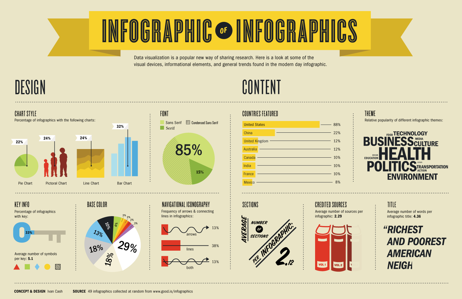
The graphic was taken from a website that provides tutorials for building infographics of your own, for those of you that are interested. The creators of this image definitely have a tongue-in-cheek attitude about this medium, as they slowly being to parse apart the most popular elements of the modern infographic. And it is here that the expose into bad statistical practice begins!
First, the creators explore the types of charts that are typically included, such as pie charts, line graphs, bar graphs, and the dreaded pictorial graph. Of all these types, pictorial graphs are the most misleading to the reader. Usually, pictorial graphs are designed as whimsical bar graphs, with the height of the images representing their different values. However, as humans tend to analyze differences based on area, rather than height, these are rarely interpreted correctly by the readers. Thus, in the example that they provide, the outline of the boy that is farthest to the right seems to represent a much larger value than the boy that is the farthest on the left, even though it is not even double the height. The illusion all comes from the disproportionately large increase in area, and it is a trick that the subconscious does not easily shake.
The graphic goes on to expound on a variety of different traits that these images typically try to employ: font styles, color palettes, the use of arrows vs. lines (vs. arrows and lines). It lists trends on legends, title length, and topics of interest. But the one thing that the infographic does not do – which arguably is the whole point of the infographic – is give the reader a very good sense of the data: what the data are, how it was collected, and how it should be treated.
For instance, of the five graphical representations that include percentages on this infographic, only two of them add up to 100% (one of those being a pie chart that only labels the percentage of two out of the three regions graphed). The graphic features a ‘word graph’, in which the size of different words is meant to reflect their level of popularity (the bigger the better). But just as with the pictorial graphs, this is misleading (is it by height? By area? What if the word itself is just longer?), and gives the reader no sense of scale or scope of topics available. And finally, the infographic mentions that usually an average of 2.29 sources are cited, but its own citation is paltry at best. It claims that 49 infographics were sampled ‘at random’ from the listed website, but this leaves much to be desired. Is this website a representative sample of all infographics in existence? Were the 49 chosen truly a random sample of independent graphics? Did any share an author or designer, and are therefore dependent in some way? How did they arrive at the number 49 for their sample, and is this ‘study’ vastly underpowered?
While I admit that infographics are a powerful tool for conveying a great deal of information rapidly to a readership in a way that is accessible, one must be careful not to sacrifice accuracy and clarity for style. If the aim is to draw a flashy image that inspires thought, then one should consider being a cartoonist instead – xkcd.com does a great job at commenting on scientific and mathematical concerns of the day. But if the true goal is to convey rigorously gathered information to a wide audience, then this ever-growing medium must be reined in, and wielded carefully.
Thanks for sharing this, very interesting! I have definitely noticed that this type of graphics are taking over the internet. I have especially noticed them relating to health issues. I do have to disagree with you (well a little) since I have noticed there are some great examples of infographics made from agencies which are trustworthy like American Heart Association (AHA).
ReplyDeleteHere is an example of one of my favorites : http://www.heart.org/idc/groups/heart-public/@wcm/@fc/documents/image/~extract/UCM_467594~1~staticrendition/ginormous.jpg
But overall you brought some great points. The data is often not correctly represented and analyzed then these graphics. Which leads to misleading information.