Showing posts with label Continuous Variables. Show all posts

Friday, May 6, 2016

Grad School Rankings...What do they mean??

In light of the recent post regarding ranking competitiveness of the UAE, I started turning over the idea of rankings in my head.  We all value rankings, whether we admit it or not.  For one, rankings help us make decisions.  I'm sure a number of us peeked at the US News and World Report ranking biomedical research programs before selecting Emory as our home.  From personal experience, I found one of the prime emphases in grant writing class to be citing the number of F31 grants awarded to Emory GDBBS students (apparently we are currently ranked program number 2 in the US, and at one point last year, we were in first place). Oddly enough, despite our high ranking in terms of NRSAs, we are only ranked number 30 in terms of biological science graduate programs, according to the US News and World Report website. How could this be?  And what does statistics have to say about this?

How Emory Stacks Up...maybe.


Indeed, some rankings are based purely on objective, raw numbers, such as the NRSA statistic. The student either recieved F31 funding, or they did not. Others, such as the US News and World report rankings, and the UAE competitiveness rankings, are based on an amalgamation of a number of factors, including some that are subjective.  I did a bit of digging to figure out what the US News and World Report numbers are based on. Perusing their website left me with more questions than answers.  Any information given on how the rankings were determined is murky at best.  The most data I could find on how they rank describes their methodology for their undergraduate ranking system (the original). As one article from their own website investigated this topic correctly points out, "The host of intangibles that makes up the [college] experience can't be measured by a series of data points."  Factors such as reputation, selectivity and student retention are cited as some of the data points that determine ranking.  In terms of quantification, however, I did not find any clear answer.  The website cites a "Carnegie Classification" as the main method for determining rank. 
The Carnegie Classification was originally published in 1973, and subsequently updated in 1976, 1987, 1994, 2000, 2005, 2010, and 2015 to reflect changes among colleges and universities. This framework has been widely used in the study of higher education, both as a way to represent and control for institutional differences, and also in the design of research studies to ensure adequate representation of sampled institutions, students, or faculty.

As you can probably gather, the quantification involved in the Carnegie Classification is never really defined and left me wondering if there is some sort of conspiracy underlying these rankings.  Reading about these rankings has left me feeling what I imagine a nonscientist feels like when they try to understand scientific data from reading pop culture articles.  Still, we continue to value these rankings, even if we have no idea what they really mean.  Yet again, we revisit the theme that there is a strong need, not only for statistical literacy, but for statistical transparency. Statistical analysis needs to be clearly laid out so that the layperson can fully appreciate the true value of a ranking.

I also wonder about how quantitative and qualitative factors that are apparently used in the Carnegie Classification are combined together to determine one final ranking value.  As we have learned in class, continuous and categorical variables simply do not mix.  Yet here and most everywhere, we see them being combined. Maybe it is beyond my level of statistical comprehension, but I wonder if there is a way to correctly combine the two?

Tuesday, April 12, 2016

Defining thresholds within continuity


Continuous variables are defined as variables that can take on any value between a minimum and maximum value.  Time, distance, and height are common examples of continuous variables.  In contrast, categorical variables can be obtained by counting or used to describe something categorical in nature, such as gender.

I’ve encountered my share of confounds when attempting to distinguish changes in a continuous variables.  In one case, I was quantifying fluorescent intensity in ImageJ, where intensity is a continuous variable.  When there is a large difference between the flourescent intensity of the two groups that I am trying to distinguish, it is easy to see differences on a graph of the raw values.  However, when attempting to distinguish intensity differences that are very subtle, (as biological differences often are), the raw values of intensity can be difficult to appreciate.  That is, it is difficult to convince myself and others that the change in flourescent intensity is biologically relevant.  Thresholding, or turning continuous variables into discrete categories, seems to be a popular choice for addressing this problem.  But where do we set a threshold such that it can maximally distinguish between multiple groups?  This is an issue we must consider, particularly for data without established positive controls.

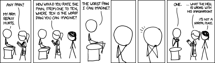
Categorical positive control??!
This become more complex when we consider elimination of bias. Is it possible to transform a continuous variable into a categorical variable in an unbiased fashion?  How do we set a protocol for defining categories for continuous variables in a way that we are not biasing ourselves towards a particular conclusion?


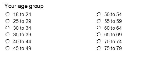
We transform continuous variables into categorical variables all the time.  One example that comes to mind are online surveys that categorize responders by age.  I always wonder about the rationale for choosing these threshold cutoffs.
Well reasoned or....random?

To vary or not to vary (the bin width)?

There are several ways to graph continuous data. One of most popular graphical representations for this type of data is the frequency distribution histogram. Because there are infinite values possible within the ranges covered by continuous data, they cannot be graphed using discrete values or categories on the X axis. Instead, the range of data needs to be divided into smaller ranges that fit together, called “bins”.

It is general practice to use the same width for every bin on the X axis. Why has this become the standard in the presentation of data? Nicholas J. Cox from Durham University presents some arguments for and against the standardization of bin widths on a Stata Software webpage. Cox notes that the division of continuous variables into bins already has some arbitrariness, and adding varying bin widths to this would be unnecessarily complex in most cases. I believe that, in addition, this added complexity could be used to mislead others through data representation. Say, for example, you are looking to plot a frequency distribution for the change in blood pressure of a group of patients before and after a drug regimen. You measure and obtain every data value on your own, so that no data is sent to you from an outside source. You choose the same bin width for every bin, and plot your data—only to find that you have an outlier that creates a bar to the right of several unfilled bins. The appearance of this outlier bothers you, so you combine this bin with all of the unfilled bins to create one large bin width. Now it looks as though the outlier is simply a right skew to the data, instead of the single value that it truly is.

Cox explains that sometimes we aren’t lucky enough to generate our own original data, however, and receive data from another source that has already been grouped into varying bin sizes. The bin sizes can’t be changed without knowledge of each individual value.  A non-biological example is illustrated below, though a similar situation could easily be found within the biological sciences. This table, with data on travel time to work (from the 2000 U.S. census), shows bins with widths of 5 from 0-45 minutes. 45-60 minutes is the next bin, followed by 60-90 minutes and 90-150 minutes:

A frequency distribution of this data would require bins of varying widths because we have no other information about how the data could be arranged. Alternatively, we could create a frequency density distribution, or a plot with frequency/bin width on the Y axis instead of simply frequency. This can be seen below:


This sort of graph is more informative when one must include varying bin widths, as the area of each bar is the number of individuals represented by the bar. 

            In short, changing the bin widths in frequency distributions has a large impact on how the data appears to the viewer. Unless continuous variable data is received in groups of varying sizes, it is more straightforward to present them using a standardized bin width. 


The appreciation of a continuous variable


The variable is a very important aspect for any scientist’s experiment. One could easily argue that the variable is one of the cornerstones of science and statistics. It is a concept that I have been taught throughout my educational career but it is a concept that I have only started to really think about in a meaningful way. Variables are not complicated, on the surface. There are two types of variables that are commonly described: continuous and discrete. The discrete variable is a variable that has a restricted value and does not exist on a spectrum of values. The common examples that we all know would be the flip of a coin. There are only 2 outcomes from this example, either heads or tails. That is, one or the other – nothing in between. The continuous variable on the other hand, is a variable that exists in many shapes and forms and tends to be more unique when compared to the dull discrete variable. Examples of this type of variable include age, height, and time. There are many different ways to look at these variables due to them existing on a spectrum. Take height for instance. You can measure this variable down to the millimeter. But in practical use do small differences really matter? Are small changes really going to affect your experiments? This is a question I have been asking myself a lot lately as I delve into my experiments and make plans to generate quality data.
              One continuous variable I have found myself thinking about lately is time.  In my lab I do experiments to measure cytokines produced by T cells. More specifically, I study T cells in the context of HIV infection. I use a method called flow cytometry to look the expression of these cytokines. Recently, in my field a lot of work has been published to show how quickly parameters for T cells can change. Much of this work involves the application of fluidics. Fluidics allows for the ability to see changes in cells instantly. Down to the millisecond. Almost instantly cytokine production and cell phenotypes can change in response to different stimuli. Current Immunology research is focused on the general Immune response. With fluidics single cells can be precisely described. The continuous variable allows for this method to be extremely sensitive and generate the great information that a decade ago was not possible. Imagine the amount of knowledge that would be lost if we did not rely on the precision possible due to the continuous variable.