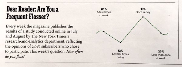
I'll admit that this is bad data visualization in the sense that it sort of suggests that these data points are linked in some way, but overall doesn't it get the same point across? I would argue that regardless of if the points on this graph are connected or not, it still illustrates the point that people floss varying amounts and also explicitly states the percentages that fell into each category. In this case, I believe that the author included the connected points as an artistic touch (basically to make the graph look like a piece of floss) which is useful in drawing the readers attention to the graph and getting them to actually look at your data.
In this case (especially since this graph depicts results from a survey on flossing) I don't think the representation is that poor. I find the artistic touch to be amusing and feel that, in a way, it contributes solely for the fact that it makes the graph pleasurable to look at. If one can get past the fact that it may suggest a relationship between the data points (and can use their judgement to deduce that it doesn't) I feel that the inclusion of the floss-like trend line contributes positively to the graph.
I'll admit that this is bad data visualization in the sense that it sort of suggests that these data points are linked in some way, but overall doesn't it get the same point across? I would argue that regardless of if the points on this graph are connected or not, it still illustrates the point that people floss varying amounts and also explicitly states the percentages that fell into each category. In this case, I believe that the author included the connected points as an artistic touch (basically to make the graph look like a piece of floss) which is useful in drawing the readers attention to the graph and getting them to actually look at your data.
ReplyDeleteIn this case (especially since this graph depicts results from a survey on flossing) I don't think the representation is that poor. I find the artistic touch to be amusing and feel that, in a way, it contributes solely for the fact that it makes the graph pleasurable to look at. If one can get past the fact that it may suggest a relationship between the data points (and can use their judgement to deduce that it doesn't) I feel that the inclusion of the floss-like trend line contributes positively to the graph.